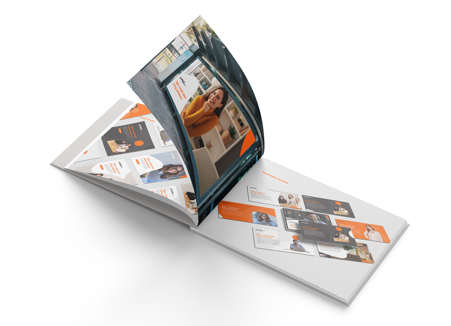

Alongside their go-to-market strategy, we delivered a new brand guide and website to help Peoply attract their dream customers.
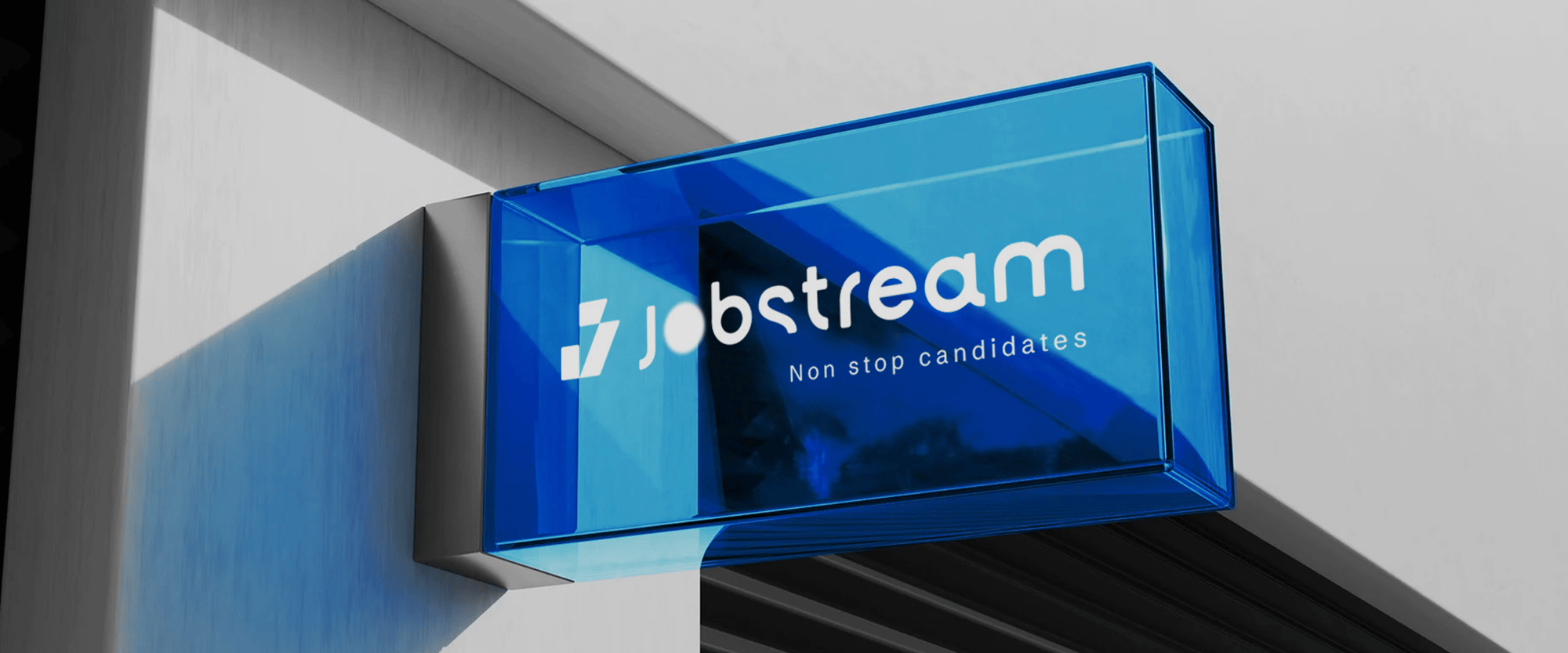
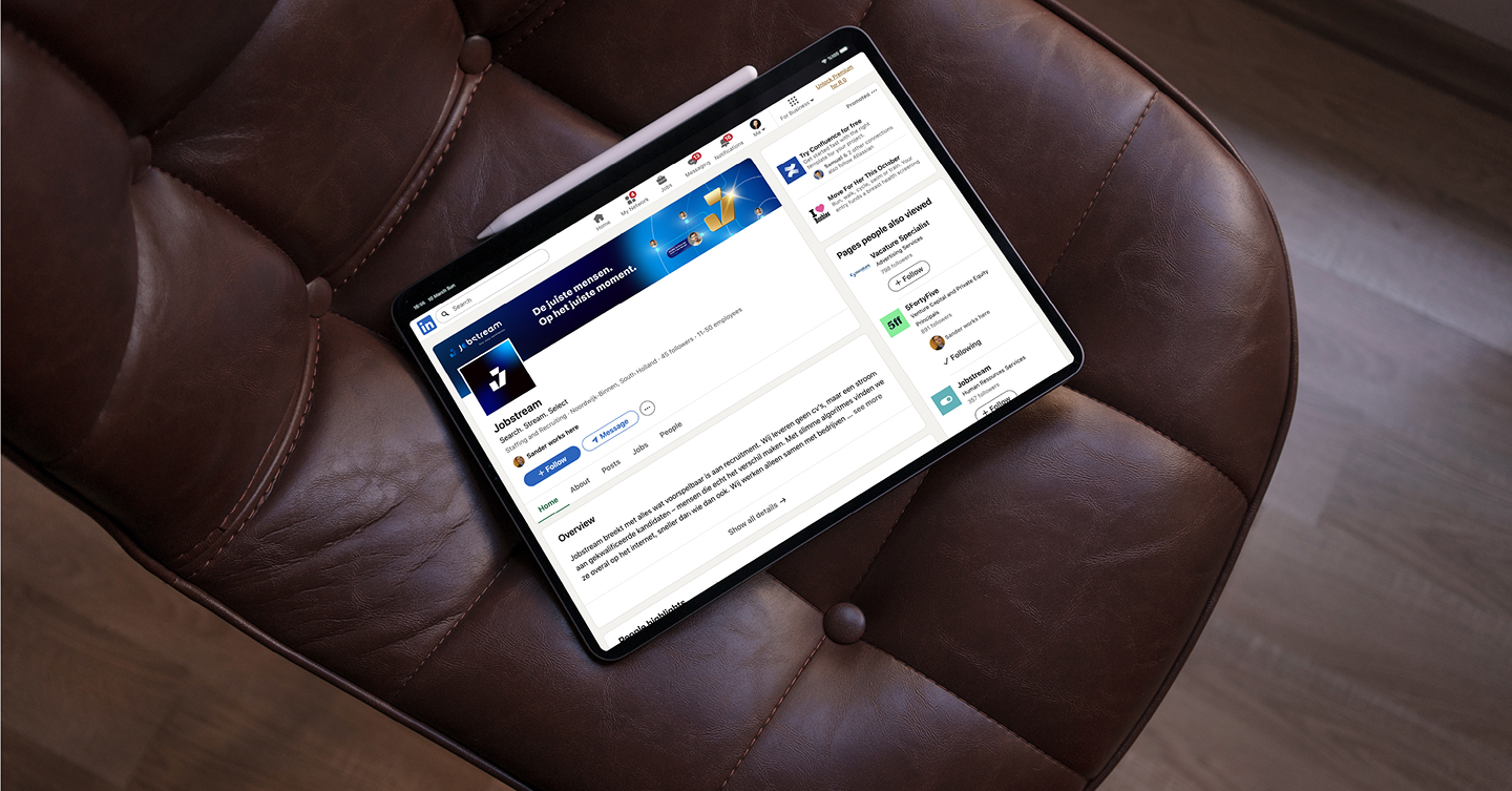
Jobstream gives mid-to-large companies a continuous stream of candidates for the roles that keep their operations running, from truck drivers to ship crew. Clients pay in advance for the stream, where a traditional recruiter charges per hire. The model was new enough that buyers kept filing Jobstream under “recruitment agency”, and a logo that could belong to any agency didn’t help.
With an international expansion planned and a legally required client portal to build, Jobstream needed a brand that could carry both. Over four workshops, we built one from scratch around what Jobstream sells: an algorithm that keeps candidates coming.
REGION
Netherlands
Northern Europe
CAPABILITIES
Brand Strategy
Visual Identity
Brand Expression
Website
Jobstream had already taken a big step by renaming themselves from Vacature Specialist, but their identity hadn’t caught up. Their simple logo with a playful wave icon felt too generic and undercut the professional idea of a “stream”. An internal redesign hadn’t worked out.
The new brand had two jobs: position Jobstream as a soft-tech sourcing solution, and attract a very specific ideal customer. We agreed to build it together over four working sessions, each one building on the last, with a full brand guide as a result.
Look through the scope of a firearm and you’ll see a precise visual system: crosshairs, also known as reticles in military terminology. These lines became the main inspiration for AFG’s new visual direction.
By integrating reticle-inspired elements throughout the identity, we created a design language that is unmistakably military yet uniquely AFG. It’s a nod to precision and the technical expertise their training programs deliver.
If Jobstream were a person, who would it be? That’s the question that opened our first workshop together. The answer was clear: a confident, understated expert of about 38, at the peak of his game, who wears quiet, premium labels and drives a BMW i8. His performance-driven energy fits the logistics and transport world Jobstream serves.
We asked everyone before the workshop to score the brand on a few scales between two opposites. While the team agreed they saw the brand as professional, composed and minimal, the scores for energy ranged from 3 to 10. This disagreement led to the most productive discussion: afterwards, the team settled on measured and calm, with plenty of drive underneath.
In the second workshop, we played the personality back as ten traits and distilled them into four design principles: minimalist, forward-looking, understated confidence and quiet luxury.
The brand also got a villain: the “shiny, shady, second-hand car salesman” feel that hangs over much of the recruitment industry. And it got a metaphor: a BMW i8, not a Ferrari. Avant-garde, controlled and tech-forward, never flashy.
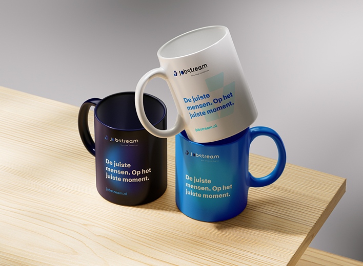
This translated into the brand’s colour palette. Deep navy and cool blues keep the brand composed, while soft gradients add warmth and light gold accents make it feel premium without turning shiny.
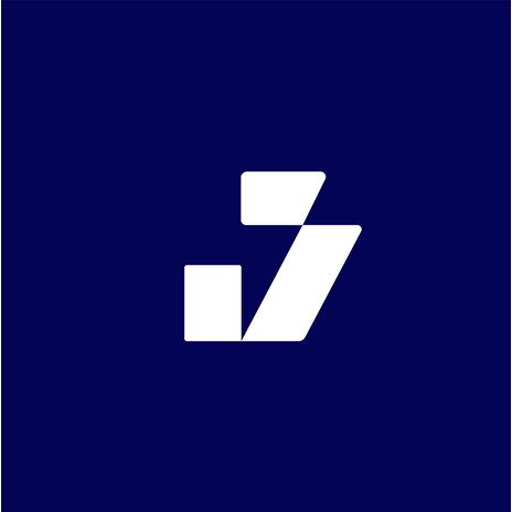
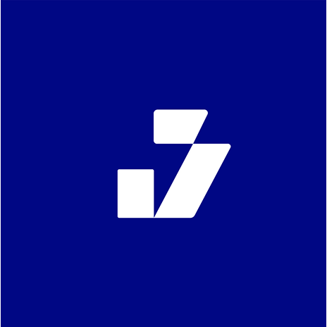
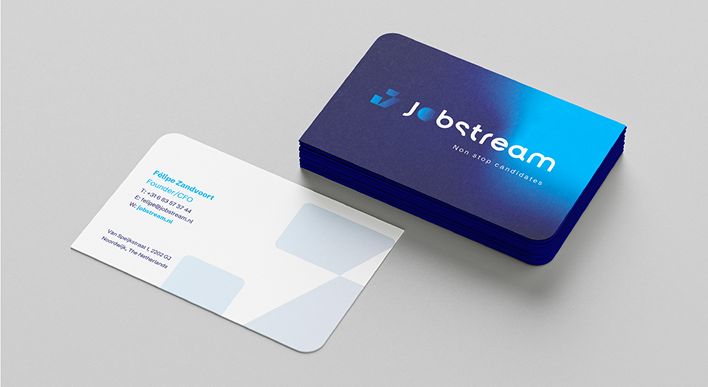
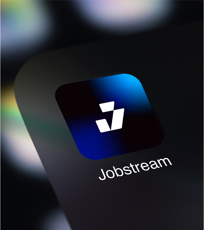
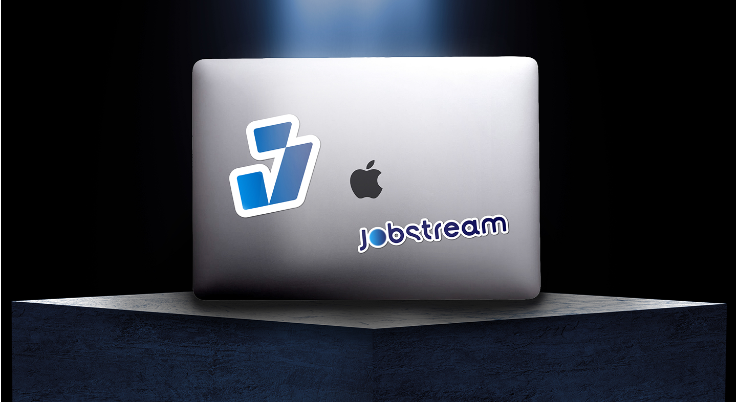
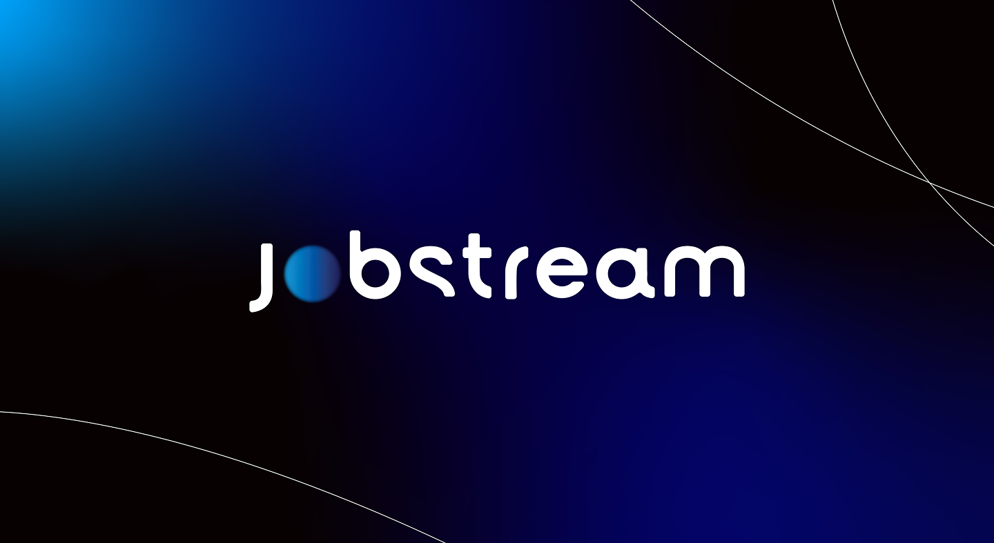
In sales conversations, it became clear that clients pay for the algorithm that keeps the candidates coming. So instead of a generic wave, we made that invisible system the centre of the logo. The “o” in the Jobstream wordmark is a soft, blurred sphere in brand blue. Next to it sits a new icon: a “J” built from two simple shapes, with a slanted stroke that leans forward. It’s strong enough to stand on its own, as an app icon, on a watch face or on the back of a cap.
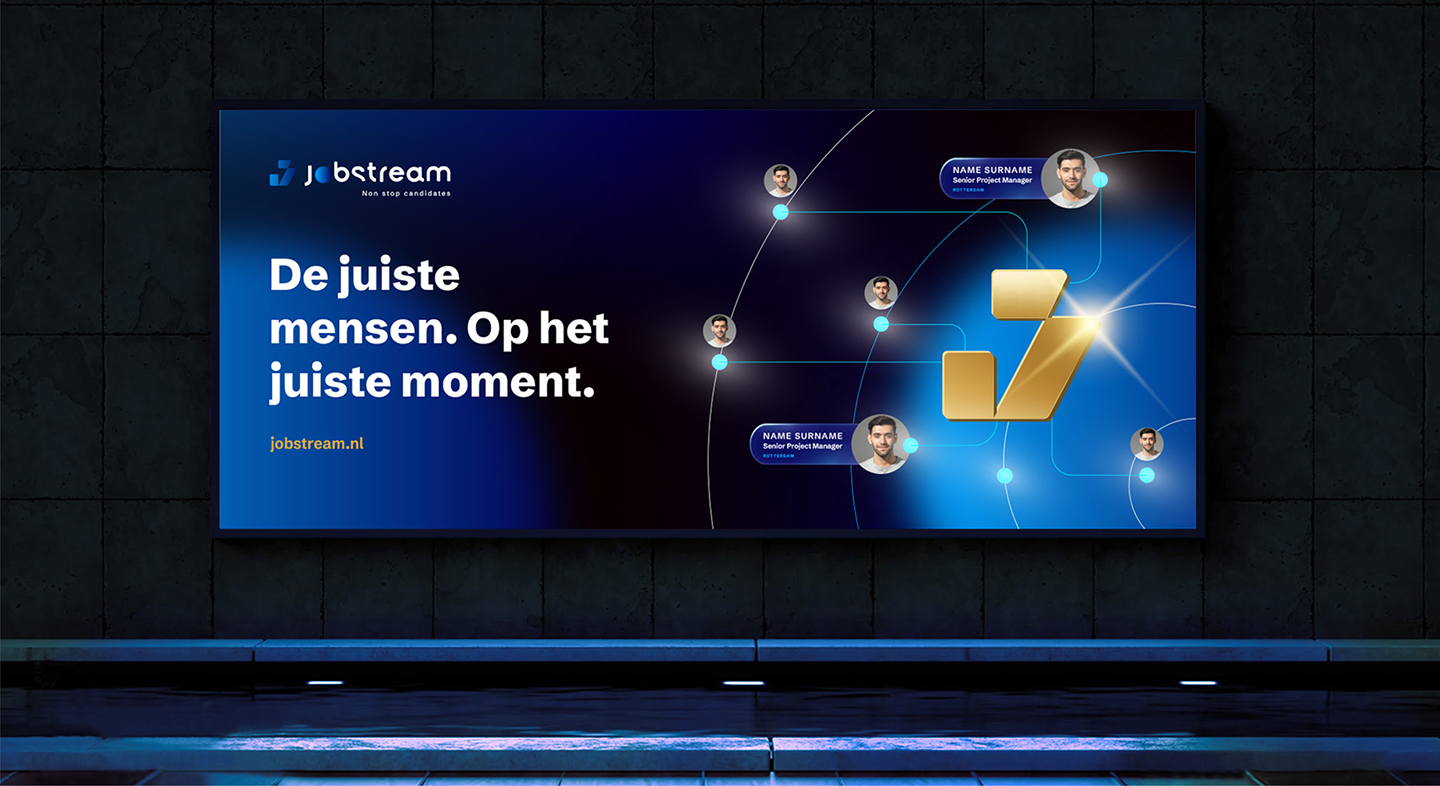
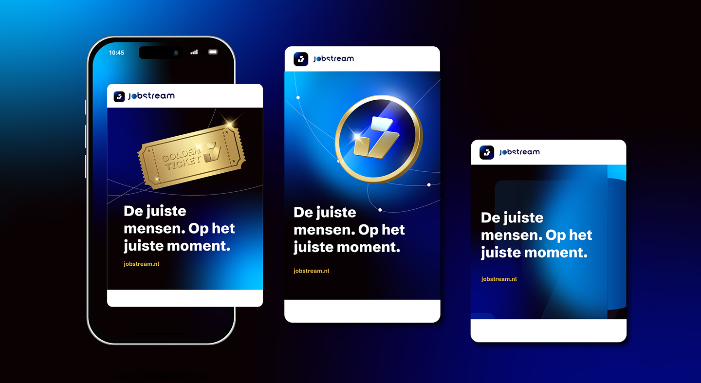
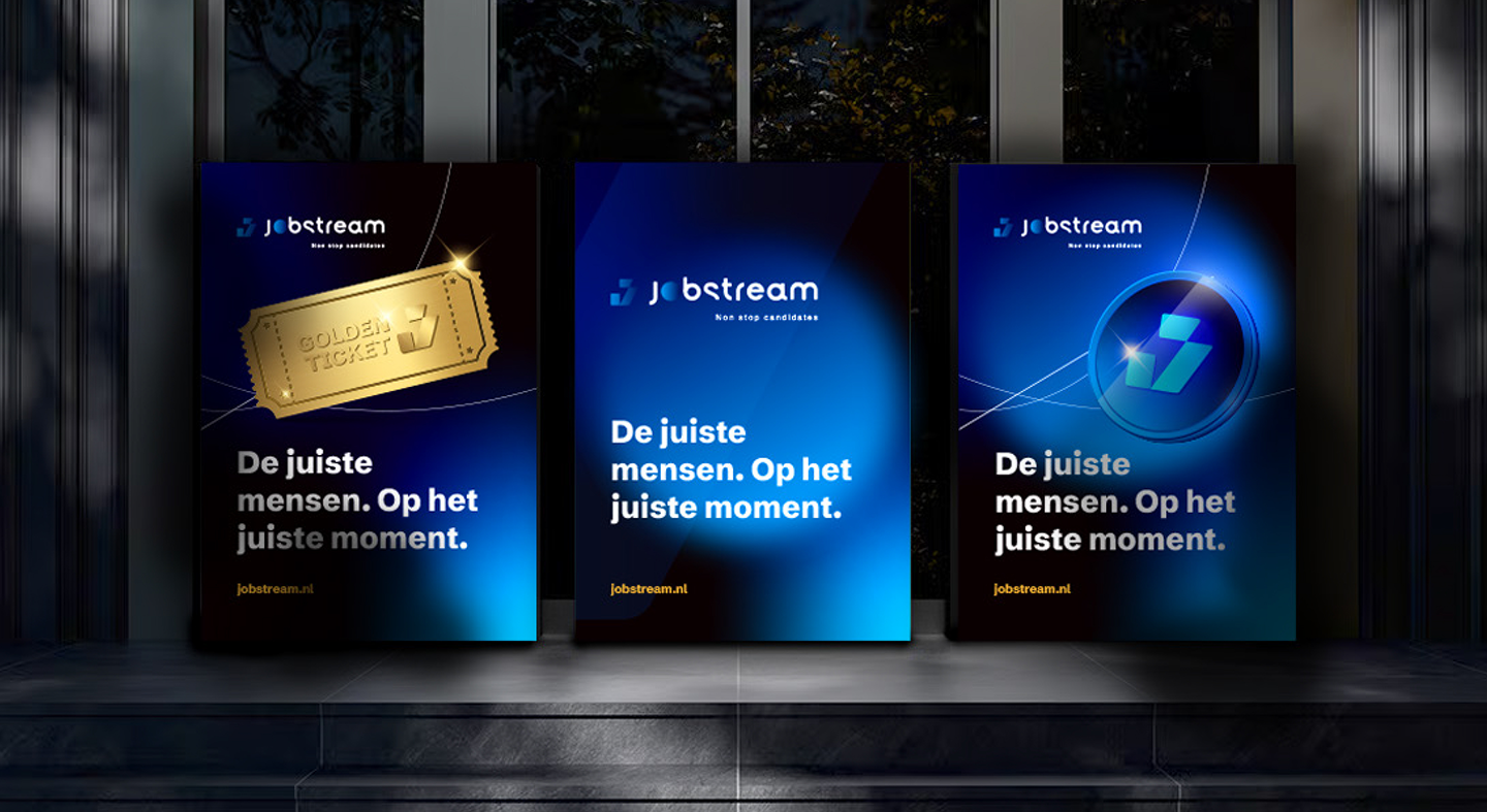
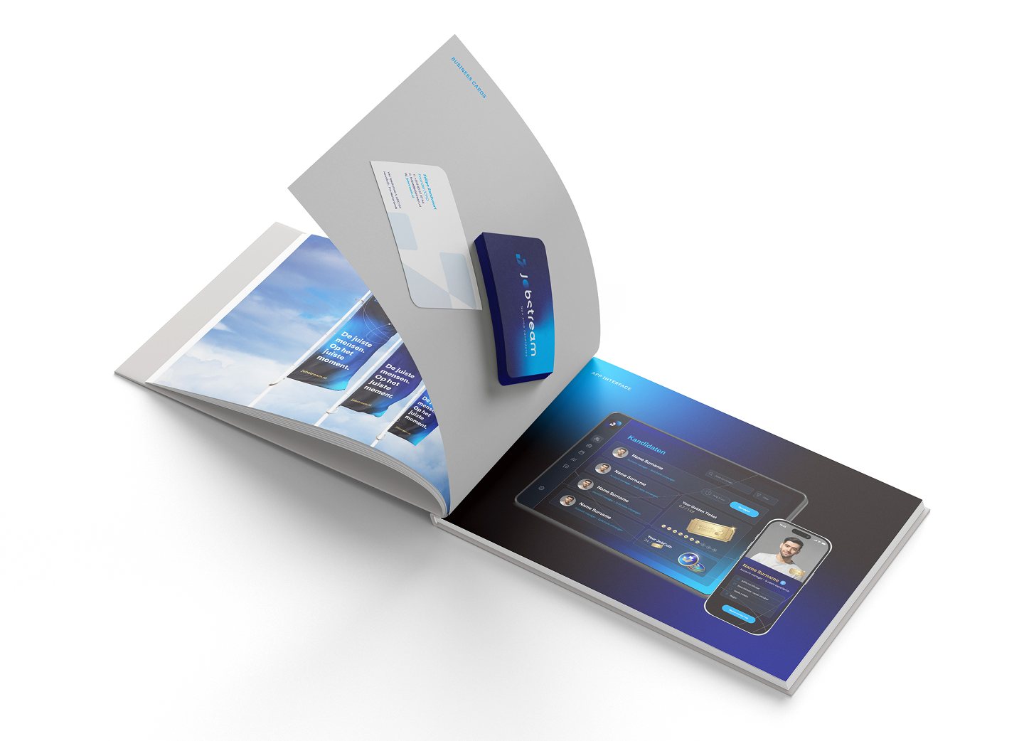
In the key visuals, people appear as small profile cards, connected by fine lines to a golden J at the centre. You see the stream at work, with candidates moving through the system and the algorithm in the middle.
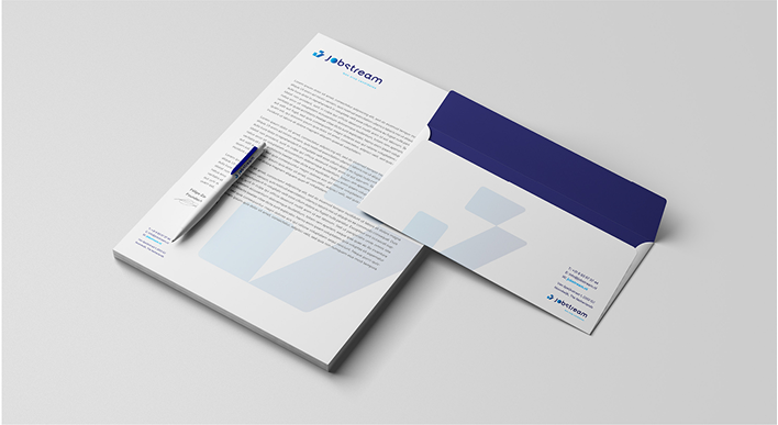
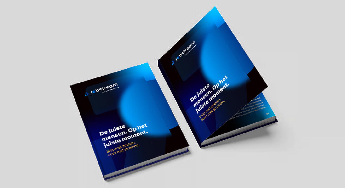
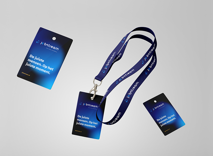
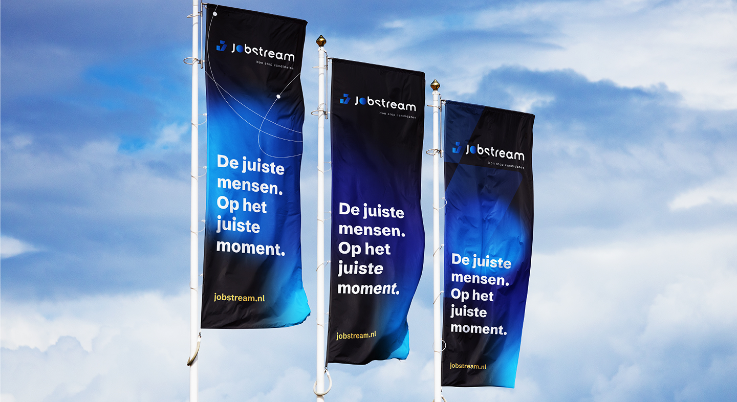
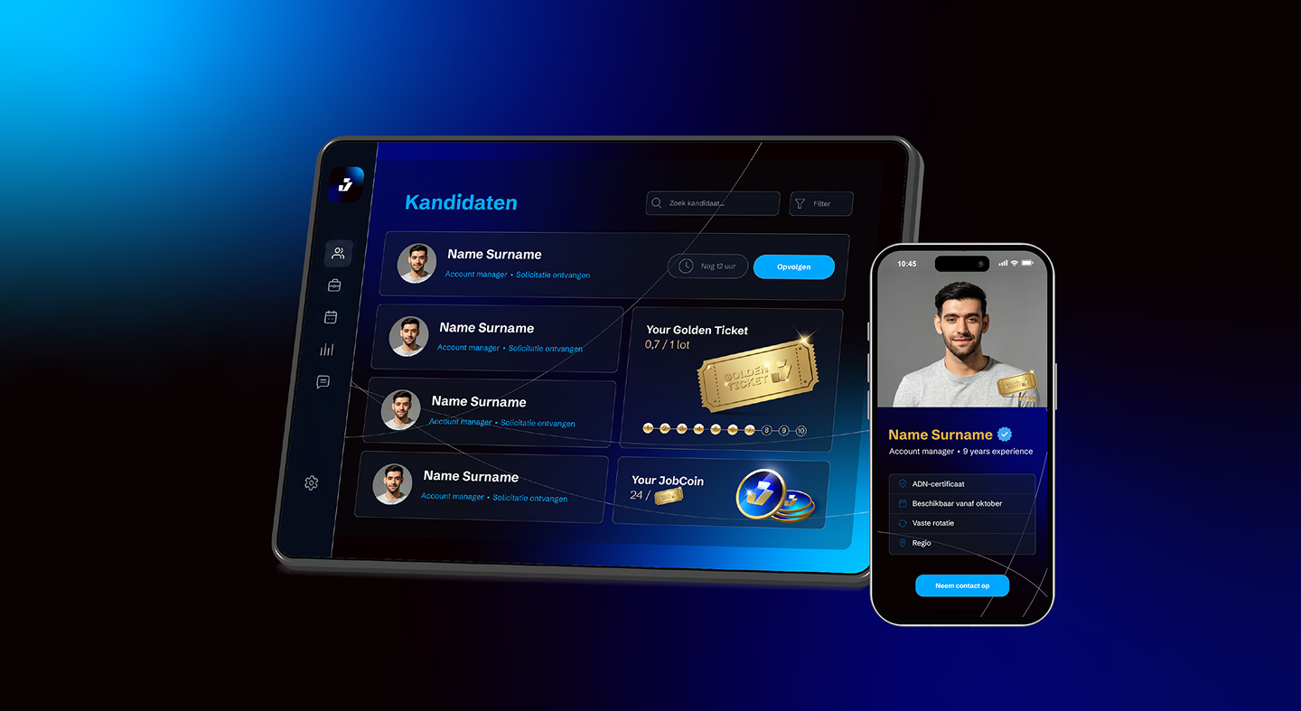
Jobstream now has a brand with a real idea behind it and a full guide to execute it, from business stationery to social media and its new website and client portal. The brand also carries Jobstream’s mission: to reduce job-related unhappiness by improving the fit between people and companies. It feels premium and tech-forward to clients, while staying accessible and human to applicants.
Alongside their go-to-market strategy, we delivered a new brand guide and website to help Peoply attract their dream customers.
See how we led the rebrand for RevelX, creating a new modern brand embodying their focus on growth and strategic innovation.
Read how we designed a full brand guide for Advanced Forces Group to help them stand out among their competitors within the security and defense domain.
See how we designed INSIFR's brand guide to help them go to market and build trust in the first halal financial platform in the Netherlands.
Exotek was struggling with communication and conversions. They needed a partner to help them clarify and correct their messaging, streamline their marketing, sales and service and successfully go to market in foreign countries.
BuurtKadoos was growing, but a high customer acquisition cost (CAC) was slowing them down. They needed a partner to help them scale efficiently, to lower CAC and to attract new customers predictably.
OKR Mentors helps businesses turn long-term visions into actionable objectives and results. But with limited SEO and a scattered tech setup, the right audience wasn’t finding them online.
Feltest had global ambitions but reaching a highly niche market across continents felt nearly impossible without the right strategy, systems and tools.
Revicoat set out to make home improvement more accessible using window frame foil. To succeed in a conservative market slow to adopt innovation, they needed a partner who could help position their solution for widespread adoption and growth.
Book a free 30-minute call with our Growth Specialists and discover how to drive more revenue with less stress.
Book your callOne email. Once a month. Real growth tips for B2B leaders who want more revenue (and less chaos).